


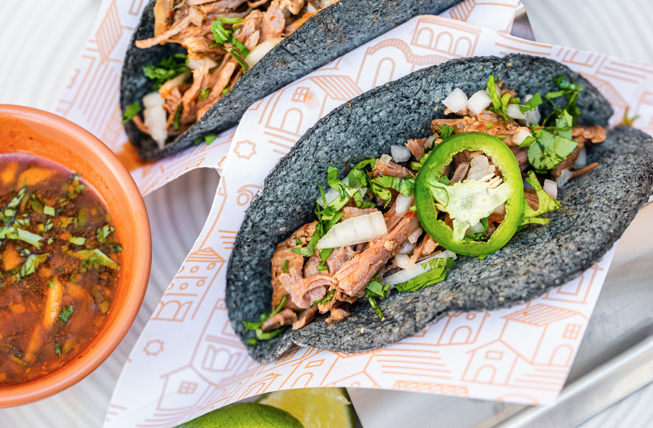


Inspired by Taxco Mexico, I created a brand that felt welcoming, transporting the clientele to the busy streets of Mexico filled with taxis, vendors, bustling buildings, and people.
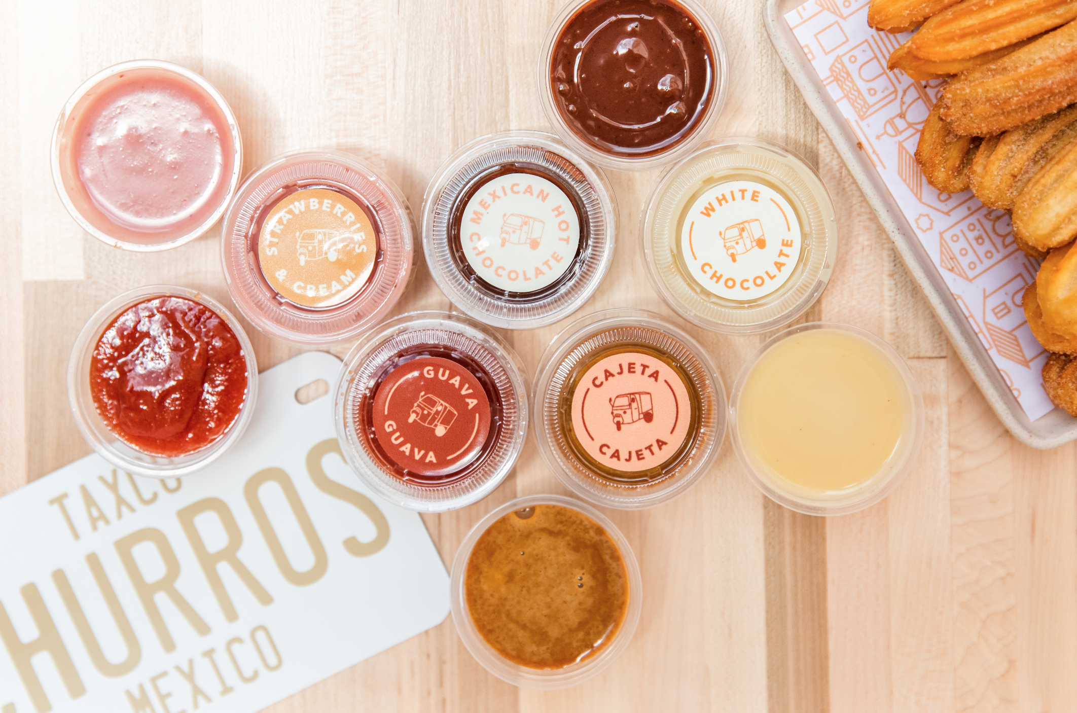
A special part of the restaurant is their churro cart and I wanted to bring this into the forefront of the branding. Solecita means "little sun" so our icon mark is representative of a sun, the shape of the end of a churro, a Mexican Coke cap-all the things you want from your favorite Mexican restaurant. Our color palette is warm like a terracotta roof, a ripe fresh mango, and a rusty iron gate. We create custom patterns that are a modern take on a sarape, cityscape, and tile with our icon pattern.
Scope of Work:
Brand Name/Restaurant Concepting, Branding Identity Design, Packaging Design